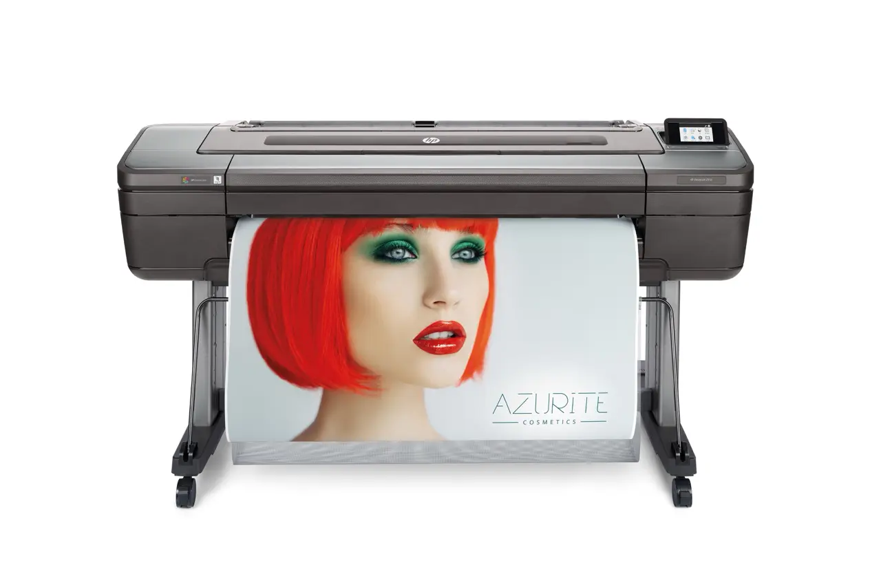
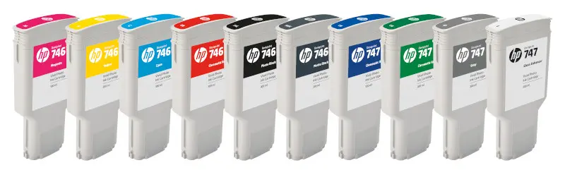
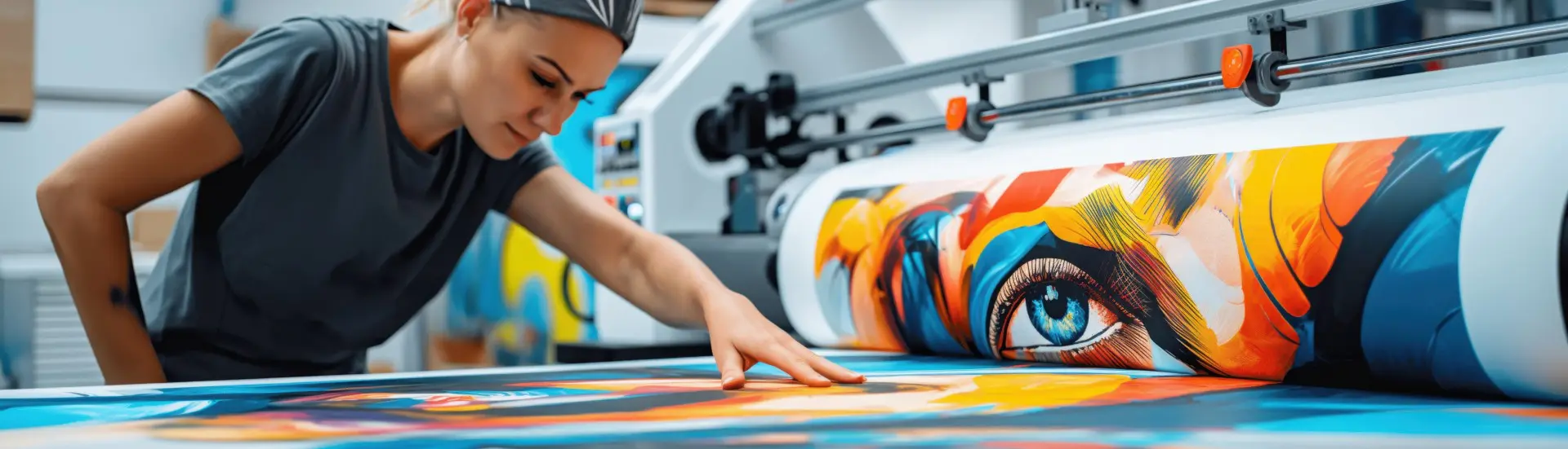
The HP DesignJet Z9+ offers a wide colour gamut, the HDNA print head technology delivers uplifted quality due to its unique technology, combined with a highly accurate colour set via the HP Vivid pigment ink range incorporating chromatic inks in addition to standard inks.
CMY Inks
CMY primaries – essential for building all secondary colours (greens, reds/oranges, warm tones).
Yellow – provides bright, durable yellow tones. Fired through HP’s universal printhead, it mixes with cyan, magenta, and chromatic inks to produce vibrant greens, reds, and highlights.
Magenta – one of the core subtractive primaries (CMY) in printing. Combined with cyan and yellow, it helps to produce the full spectrum of secondary colours (reds, purples, pinks, blues, etc.). In the HP Vivid Photo Ink set, the magenta ink also interacts with Chromatic Red and Chromatic Blue to further extend the colour gamut</em></p>
Cyan – forms the foundation for greens, blues, and cool tones. Fired through the universal printhead, it mixes wit
h yellow, magenta, and chromatic inks to produce vivid, durable, and colour-accurate results
Black and Black and White Photography
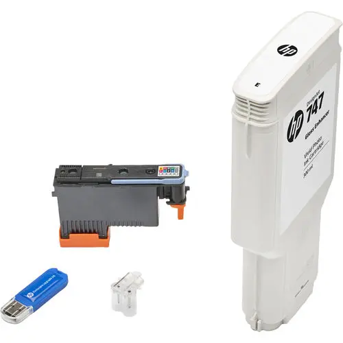
Outstanding Black and White is achievable through the 2 blacks and grey, in addition, to the optional Gloss Enhancer clear ink specifically for glossy media.
Photo Black – deeper, richer black tones optimized for photo, fine art & graphic printing, especially on photo papers or coated media (glossy, semi-gloss, satin and pearl) rather than matte.
Matte Black – designed for non-glossy media, fine text, graphics where glare should be avoided.
Grey – used often for neutral tones, smooth gradients, reduces colour casts in darks or shadow; it’s subtlety better than just using photo or matte black. Helps produce more even gradations in grey scale / shadows, avoiding oversaturation and unwanted colour shifts in neutral and shadow areas when using just the standard CMY and black inks.
Gloss Enhancer (optional) – This low cost addition when printing on glossy paper, areas with heavy ink coverage (like dark blues or blacks) can look shinier than areas with light coverage (such as highlights or mid-tones). The 747 gloss enhancer lays down a thin, transparent layer across the print surface to even out any differences. Makes the entire image look more consistent, professional, and photo-like.
Also reduces “bronzing,” a phenomenon where metallic-like sheen appears on dark areas when viewed at an angle. Giving prints a more natural, photo-like appearance.
Vivid Chromatic Inks
The addition of these inks provides a much wider colour gamut with more vivid colours and lets the printer reproduce more saturated tones, more vibrant reds/blues/greens etc. HP, state that DesignJets with chromatic RGB Vivid Photo inks have ~26% greater colour gamut compared to earlier models without those extra colours.
Better matching to RGB / Screen colours
If your wide-format print images are RGB-based (e.g. photography or digital work), then having extra inks helps you reproduce those colours more closely in print, reducing the difference between what you see on screen vs on the physical print. Due to the extra hues, you can match more Pantone colours or corporate colours more closely without needing to do special spot colour processes. (HP claims high Pantone coverage for printers using vivid photo inks).
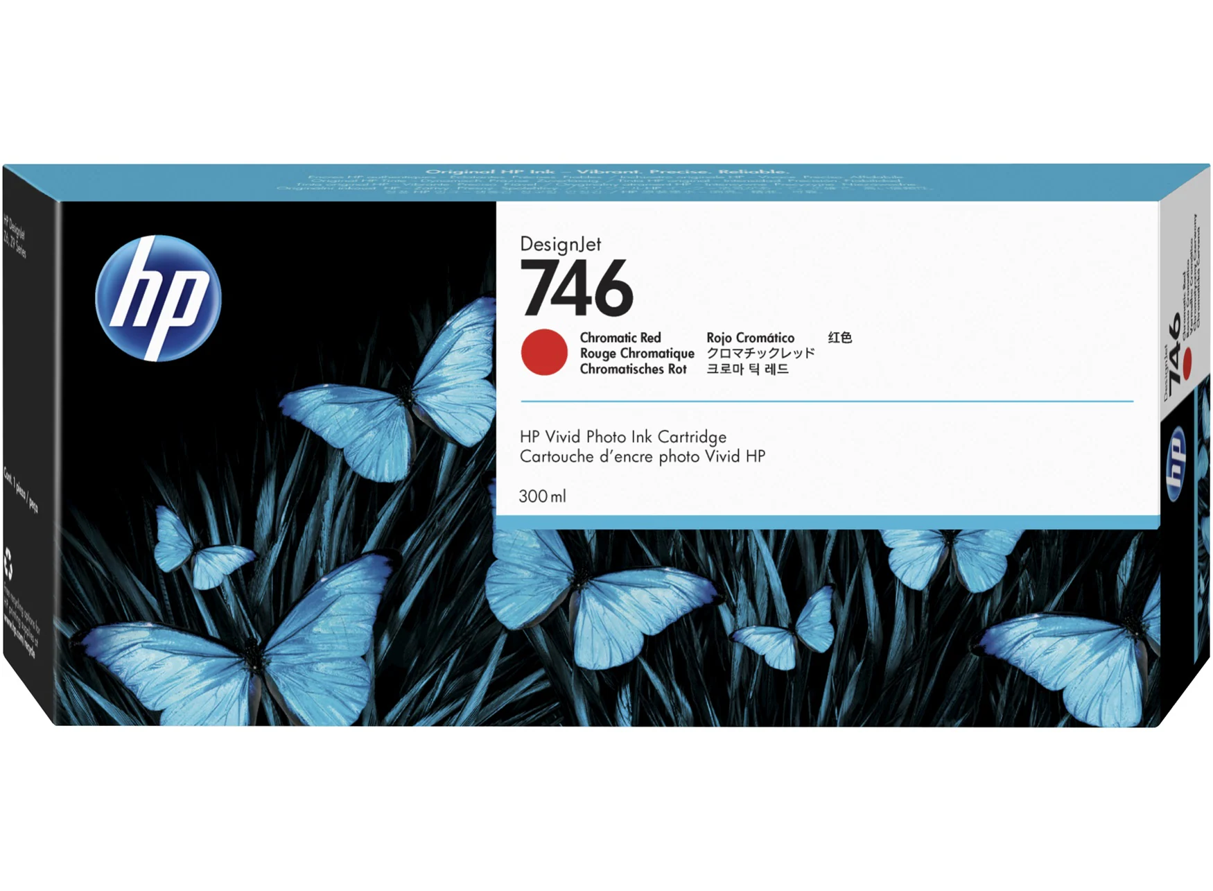
Chromatic Red – Instead of mixing red from cyan + magenta (which produces a duller, less saturated tone), HP provides a pure red channel. This “Chromatic Red” extends the printer’s colour gamut — particularly in the saturated red, orange, and warm tones that are hard to reproduce with standard CMYK.
Chromatic Blue – developed to provide a wider colour gamut and more vivid blues: gives a more saturated, accurate blue than simply mixing standard cyan + magenta inks. This improves the blue in sky or water, for example. Offers higher contrast colour: increasing contrast and tonal gradation in blue-dominant parts of images.
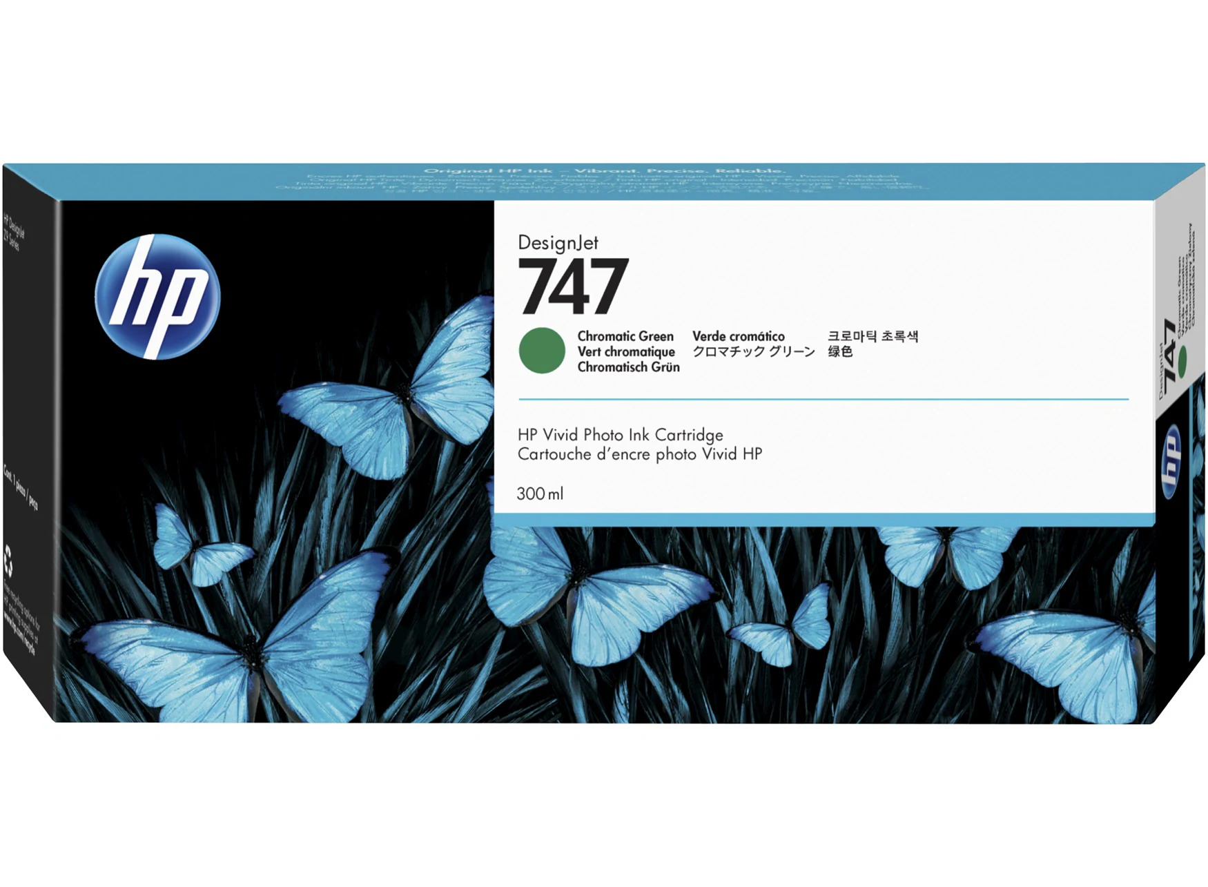
Chromatic Green – get better print fidelity in green-rich images. Standard CMYK can struggle to produce very saturated greens without artefacts or loss of tone, the dedicated chromatic green helps produce more accurate, vibrant greens in photos, fine art and posters.
Need a sample, contact us